This week I am just full of different ideas for wha I could create – I often do this, and recognise this as a vital part of my design process now.
But, in order to sift the crap from the good, I need to really understand the different data visualisation styles I like and the validity of my ideas. By comparing other designers and visualisations I like, I’m able to look at the amount of information taken in, the way it’s been condensed and the changes they’ve made to the layout in order to make the visualisation appropriate.
Take, for example, McCandless’ design for Plane Crashes and reducing you chance of dying in a plane crash – quite a morbid subject and not one that you’d think about looking up… But it’s displayed in a really clear, honest and human manner.
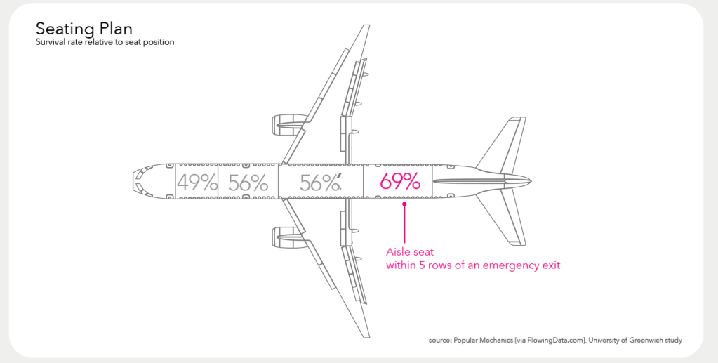
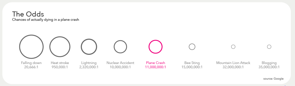
He was evidently dealing with a high amount of data here and so displayed the results and his findings in multiple formats. From this, I’ve realised that it doesn’t necessarily have to be just one piece of design to show a whole massive topic, by splitting it down into the important sectors, we’re able to see and visualise this information much more clearly.
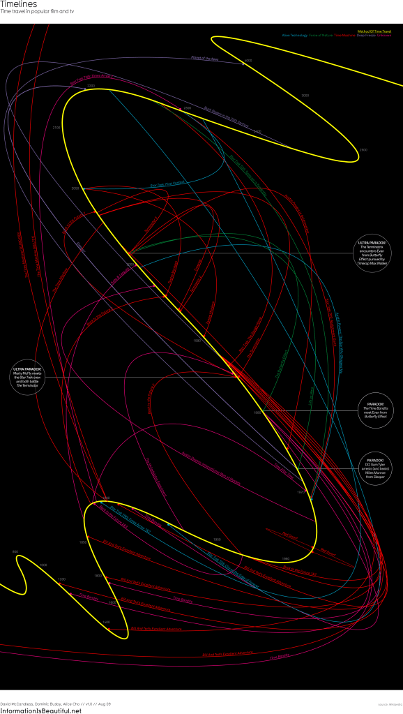
Another amazing piece of data visualisation is the above infographic about time travel in movies – He initially started with a straight timeline as we all recognise – but upon completing his design, he realised it wasn’t clear and couldn’t be viewed easily and with clarity. Therefore he created this wavy line, meaning we’re able to track the time travel jumps and the lines are clearer. I also love his addition of which film characters meet and when, as a little bit of fun fan fiction! To me, this also shows that we don’t have to go down the route of heavy, serious data sets – we can choose something fun and light hearted that might not be of any use to any one, but is a bit of a laugh.
I’ve had to write down all my ideas in a list here – I’d been scribbling them on the sides of my notebook whilst watcing the lecture and most of them are illegible…
- Uptake of Yoga/Mindfulness in 2020 compared to reported stress levels
- Truth behind documentaries – Upon research I found this had been done multiple times!
- Film Stats – Comparisons between highest grossing films and Netflix releases
- Mindhunter (Netflix becoming a bit of a running theme) – the “traits” that make a serial killer
- FAOSTAT – Global food supply
- Google searches or trends about the Pandemic
- News Headlines on each day in 2020 vs most hashtagged/tweeted topic on the same day
- Where does my cat go at night – attaching a neon glowstick to his collar and tracking his movements around the house… or is this bordering on animal abuse?
I also want to consider the manner in which my information is portrayed – I was always considering just the digital design route but I would love to utilise animation to make the topic speak.
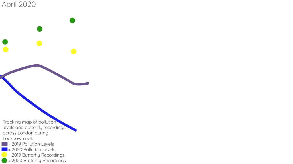
After a number of weeks creating a remarkably unsuccessful data video showing the characters in Avengers film based on screen time vs amount of films they star in, I went back to the drawing board and focussed on a more productive and important topic. Butterfly conservation.
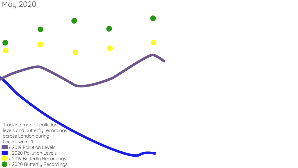
The skip over to butterfly conservation was borne from a conversation with my neighbour over the sheer amount of butterflies we’ve seen in the past year and we both believed it was due to lower pollution levels and fewer cars. I wanted to see if my thoughts on this were correct.
I first researched london pollution levels – I wanted to stick to a bigger city which I knew had seen dramatic pollution changes – York is a relatively small city and wouldn’t have seen such drastic changes. We also don’t have a Butterfly society like London so it made sense.
Using the information gathered on the pollution levels, I decided to do a comparison year – on – year – 2019 pollution levels vs 2020 pollution levels – of course Covid hit us in March 2020 so I decided to use the months of March, April May and June for direct comparisons.
The differences in pollution levels were staggering and I was shocked at the difference. This HAD to be having a big effect on animals and insects in the city so I needed to find the different recording sites for butterflies – turns out there’s quite a few, but the Butterfly Conservation allows you to search butterflies found and recorded in areas all across the UK. London also has a number fo nature websites for insect lovers to record sightings.
I then distilled the information and vast data gathered to create a moving graph depicting both pollution levels and butterfly recordings from the same months in 2019 and 2020… Click on the image below to be taken to the full video:
Reflection
I’m still getting to grips with After Effects and there was a surprising amount of work needed here.
On reflection, I realise I missed out some important and vital information that is required in these graphics:
Numbers – it’s ok giving people moving images and dots showing the increase or decrease, but I’ve not displayed the actual amounts. This is absolutely a rookie error and something I hope I will have the time to go back and correct.
Findings/sources – I’ve not included my sources, something that is also absolutely vital in a project like this. You need to show your information was both factual, correct and can also be traced.
Overall, this was a huge project for me because I’d changed direction mid-project. However, I am so proud of my work on after effects and I can see my improvements. I made too many errors here that wouldn’t be admissable if I was to publish this, the lack of clarity, valid information and clear data is a big error that I can’t look past.
I truly believed data visualisation was up my street, but I’ve since realised it’s not all pretty pictures and graphics, it’s true, real and valid information and it needs to be treated in a precious manner.
I think, had we had the opportunity to spend 4 weeks on this, I would have created something much more polished and informative, but in the appropriate timing given I am proud of my work.
Bibliography
Beautiful, I. is (n.d.). Reduce Your Chances of Dying in a Plane Crash. [online] Information is Beautiful. Available at: https://informationisbeautiful.net/visualizations/reduce-your-chances-of-dying-in-a-plane-crash/ [Accessed 12 Feb. 2021].
Beautiful, I. is (n.d.). Timelines: Time travel in popular film and tv. [online] Information is Beautiful. Available at: https://informationisbeautiful.net/visualizations/timelines-time-travel-in-popular-film-and-tv/ [Accessed 12 Feb. 2021].
https://www.londonair.org.uk/Londonair/Forecast/
https://lnhs.org.uk/index.php/articles-british/391-london-butterfly-atlas-project
