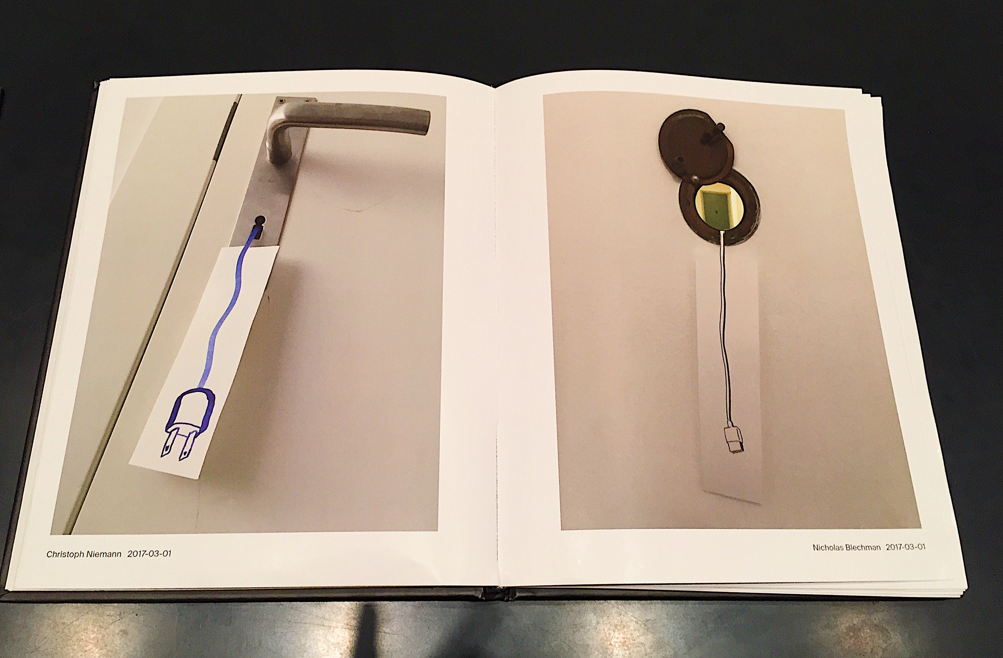
Niemann and Blechman have a long standing history of collaborative illustrations, working together on works for New York Times and other illustrative designs. Their focus, when working with another illustrator is to have a sense of trust and faith in the other person – this, Blechman states is vital to ensure you’re able to work together and can successfully create together. Their similar design style merges perfectly together to combine their wit and humour in simple drawings.

For many years, from the late 90s, Niemann and Blechman created a small outlet for each other from mainstream illustrations they were both involved in. They would take a theme and start a collaborative illustration – Niemann would draw in blue pen, Blechman in black. The conversations had to be non-verbal and relevant to the theme. This small outlet grew for a number of years and they published different books based on different themes.
Fast forward a number of years, they were both involved in a MET exhibition “Talking Pictures” – inviting artists to take pictures and send them to each other to highlight the real-time intimacy of capturing images on a camera phone. The other artist would then have to send another back as a form of “non-verbal conversing”. Both Niemann and Blechman used this as an excuse to start up their illustrative conversations again and it has resulted in a successful limited edition print.
Following this long history of using illustrations and smartphones to successfully converse, it’s evident in their publication that this trust and faith runs through out and results in complimentary, reflective work.
Their work makes you stop, think and smile at the same time – the juxtaposition of their ideas and illustrations can only be achieved through successfully collaboration. Utilising their smartphones to take their work to a more immediate level means the opposing piece has been thought of swiftly, with little time to overthink.
The amalgamation of both smartphone technology and traditional illustrations results in a successful, witty book with no need for words.


The Design

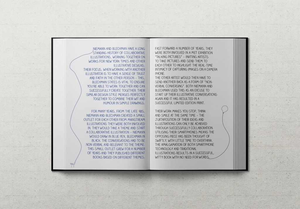
In regards to the design of this week’s piece, I really needed to highlight the child-like nature of Niemann/Blechman’s conversations. I chose a font which reflected handwritten scribbles – a formal font just wouldn’t be necessary when discussing their work. I downloaded the Claire Hand font and I think it works perfectly to reflect the personality of their collaborative work. I also added in some simple illustrations – this was more fun for me than a design feature but I think it’s also a really nice addition of my take on their work. I focussed on ensuring the left hand side was written in blue and the right hand side in black – again a direct representation of how they displayed their work in their book.
Hopefully I’ve done them justice – they are such great, witty and inspiring illustrators. To me, they are a testament of how a years long relationship can be used to create a wonderful collaborative project that stands the test of time – and can be revisited and reworked time and time again.
https://www.metmuseum.org/exhibitions/listings/2017/talking-pictures
https://www.nicholasblechman.com/conversation-1
https://www.christophniemann.com/detail/conversations/
https://www.metmuseum.org/press/exhibitions/2017/talking-pictures
https://www.nytimes.com/2017/07/06/arts/design/an-exhibition-worth-thousands-of-words.html
https://elizabethsteinocher.com/2017/10/08/how-christoph-niemanns-witty-art-challenges-me/
