
I found it really interesting this week to look at Susanna’s comment of the relationships needed for working within collaborative design. Quite often, collaborative design is borne from the requirement of another skillset or the needs of a project – but I love the idea of using collaboration to work with some you know, or admire and taking this opportunity to create something together.
Listening to Christoph Miller discuss the multidisciplinary direction of their studio was so inspiring – I find sometimes Graphic Design can be so samey and homogenised that it loses that excitement that drew us to this industry int he first place. Having different focusses in self initiated or research based disciplines means they can sometimes merge, sometimes be more prevalent – but no two tasks the same.
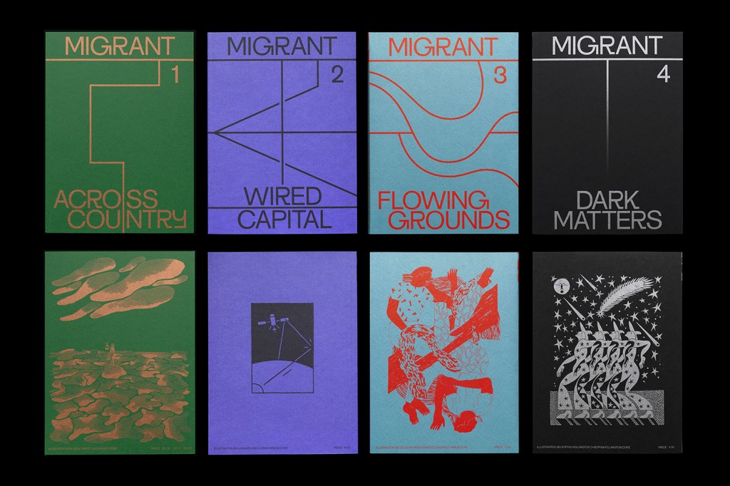
Their research behind the Migrant Journal was intense – their use of experts to help them tell a story in the most factual way possible is what collaboration is all about! To be able to use other specialists to help people understand the issues behind money, migration in the sky&water, illegal migration and trading routes means their work is so much more rounded. I LOVED the idea that they acknowledged that their editors and designers had all migrated at some point and there is nothing to be ashamed of or to hide about that fact.
It was evident that they used a lot of digital tools to help with their collaborative projects – skype etc. for video calls. It’s so necesary to be able to talk to people about these issues and get their emotions rather than just a typed paragraph.
Hato Studio also really impressed me with their completely novel ways of thinking. The co-creation, community based projects help engage young adults and the public in a way that sometimes design can not. The magnetic Lichtenstein pop room idea is something that can involve people of all ages, and not only learn about a fantastic artist but emerge themselves in his particular style.
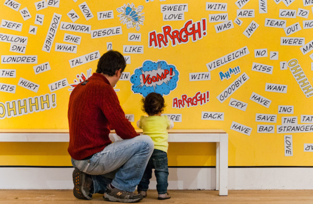
This particular studio decided to work with children on a collaborative project rather than other artists or adults – they needed the naive imaginations that children offer to create a really fantastic piece of work that helped the children to realise they were the main creators of the Space Bus!
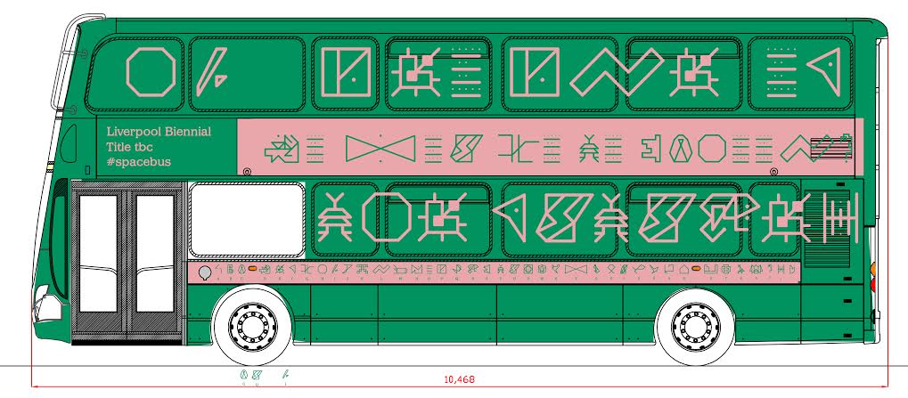
They discussed their creation of the digital interface so the designs and pictograms of work can be brought together easily and can also then be manipulated by them to make the most of the work.
They are also evidently steps ahead in terms of bringing in the public for collaborative projects – choosing the random marks or shapes drawn by the public to be displayed for the D&AD Awards rather than the typical design you might usually see. It’s such an inspiring use of AR to bring people into the digital age and feel like they’ve achieved something so great it’s displayed at the biggest design awards!! This reminded me a lot of Matt’s final piece during the last module – the VR studio where people could go in to create artwork collaboratively.
We’ve looked at Pearl Fisher before regarding the amazing work they do – bringing in artist from around the world and using their local artwork to bring products to life that have a relevance in their societies.
Looking ahead to the end of this brief, I think I will definitely want to explore a digital tool that can help bring in artists from around the globe to really put their stamp on a particular project. But also bringing in collaboration within their societies – imagine having a product that has heavy influences from, say, Brazil – having a digital tool that can be taken into schools, and have the children from that culture create something significant to them that reflects their past and their present and is used on a main stream project around the world.
It’s definitely food for thought!! Below, I’ve written some in depth analysis of examples of collaborative work I’ve come across during my research into this challenge. I found some examples that definitely needed touching on before I complete my workshop challenge.
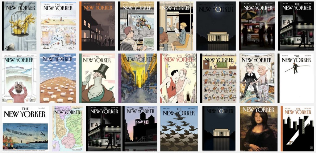
The New Yorker
This magazine can sometimes be controversial in it’s portrayal of certain topical issues, but it’s traditional, recognisable front covers, for me, make it a really interesting artistic focus. It needs to be instantly recognisable for the particular story it is telling.
Danielle Pender (Nicer Tuesdays talk on Youtube) discussed how Francoise Mouly connected with her on wanting to create a magazine that broke the moulds (discussing Mouly’s RAW venture). I researched more into Mouly and found that, despite having commissioned over 1000 covers for The New Yorker, is not necessarily a household name. She works alongside a different artist each week, to create a “culturally relevant” piece of artwork for the cover.
Mouly’s love of comics led to the creation of RAW magazine with her husband (cartoonist Spiegelman). Co-editing this magazine together using their strengths helped “champion graphic artists who were little known to … readers”. Through this work, she realised the power of visual art and the need to work alongside other artists. Her focus for the New Yorker was to combine the “simplicity of means with effectiveness of communication” to portray a story that can be read in a split second.
A simple image can cut through the torrent of images we see every single day”
In focussing on collaboration, they bring artists into the forefront of a magazine read by thousands and celebrate how these artists enhance the cultural dialogue. Utilising multiple sets of skills is vital when working on something so powerful – to be able to work alongside so many different artists, appreciate their individual style and celebrate this is a what makes these covers so influential.
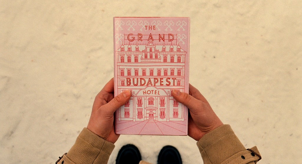
Wes Anderson & Annie Atkins
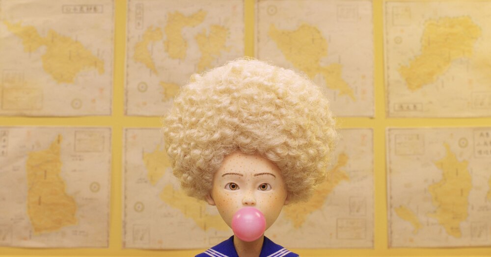
Again, not your typical design collaboration but still something I find really fascinating. I’ve always loved Wes Anderson’s work – the colouring he uses, symmetry, his particular style through out, I’ve always wondered if he has a really strong influence of the graphic design within his films. Enter Annie Atkins… She’s had many discussions with design publications about how she goes about creating artwork for his movies.
This is a huge demonstration of the film director getting hands on with the imagery within his films – Anderson writes the detail that on all the paperwork that is only ever seen for 5 seconds in a shot. Atkins designs it to his style and that of the film and produces it carefully so every aspects of the filming is perfect. This combination of perfectionism and display of adaption shows how much collaborative work is heavily weighted on a certain style. If her style didn’t match that of Anderson’s would he have hired her – probably not! Annie’s work really does reflect his style and they obviously work very closely to ensure all details are as accurate as possible. He steps out of his zone a film director and helps the graphic designer.
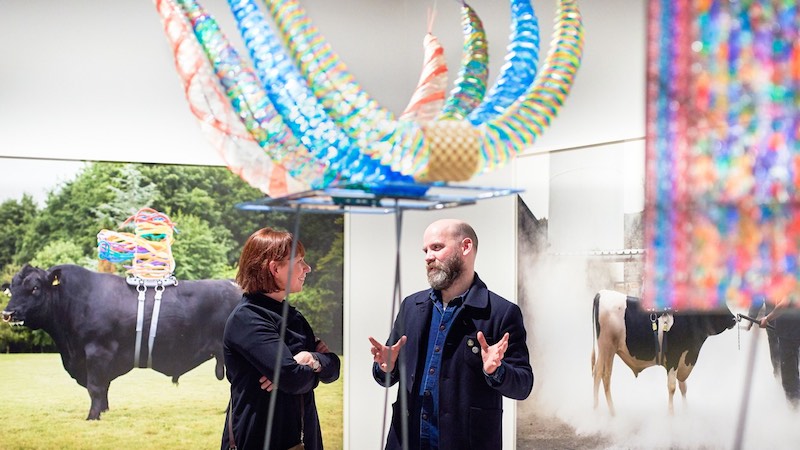
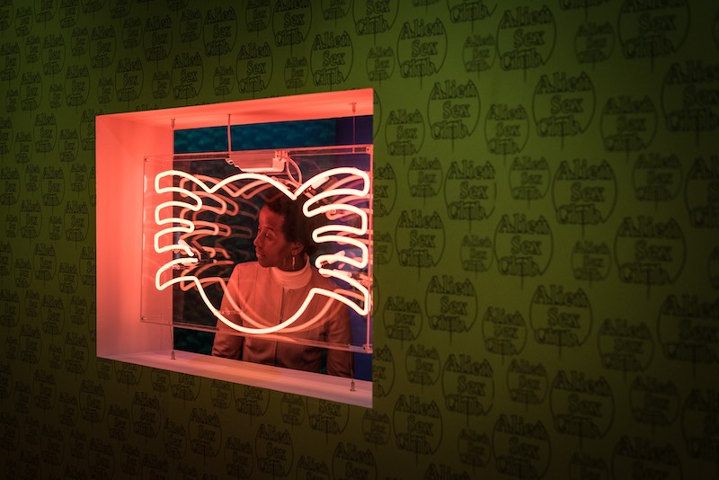
Somewhere in Between
This Art/Science exhibition demonstrates perfectly how collaboration within different fields can merge so perfectly to create something to educate and immerse the public. This exhibition was made up of 4 different art-science projects each exploring a different field of science.
To represent the issues within genetic enhancement of animals, artist Maria McKinney created sculptures to be worn by the animals made out of artificial insemination straws. With the help of scientists she was able to combine the scientific research and products into a visual artefact.
It shows, for me, how collaboration doesn’t need to be with just artists or creatives, but can in fact be just as relevant with a scientist – and your focus is bringing both worlds together in a way that can be understood.
https://www.itsnicethat.com/articles/riposte-magazine
https://www.itsnicethat.com/articles/annie-atkins-grand-budapest-hotel
https://classiq.me/interview-with-film-graphic-designer-annie-atkins
https://www.newyorker.com/tag/covers
https://www.labiotech.eu/bioart/wellcome-collection-somewhere-in-between/
