How can typographic conventions and design inform and imbue the meaning of a given text?
Firstly, when looking into typographic conventions and design I came across a lot of “shaped” typography – where the words form a shape which directly links to the meaning of the text or poem. For me, this is the most obvious choice for using typography to emphasis a meaning through text and image. I love this style of typography and have explored it a few times in the past. But for me, personally this week, I wanted to chose a new style that might have further, perhaps not so obvious meanings.
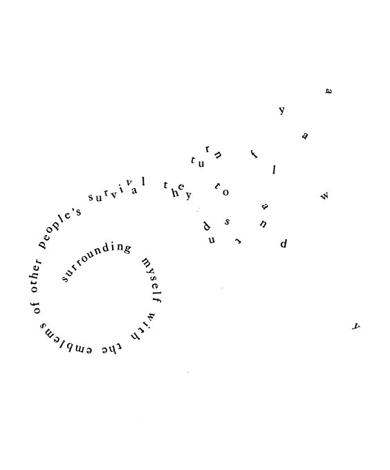
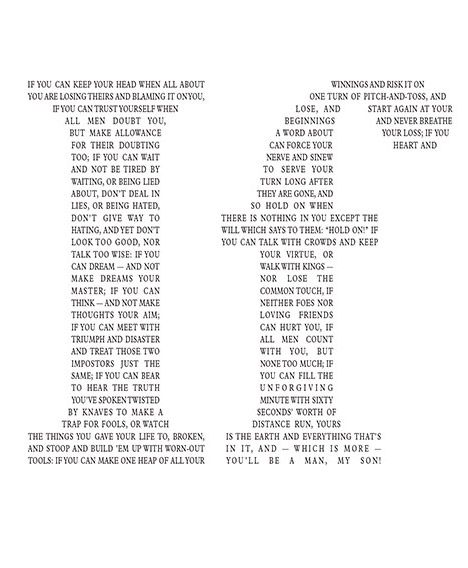
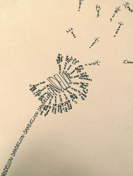
This style of typography is certainly beautiful and I love the emphasis on shaping and certain letters. Take for example IF – this post really shows how you can careful shape each piece of text into one title message which is being read the whole time. The dandelion example is also beautiful but I don’t think the word “dandelion” necessarily needs that much emphasis – it’s obvious enough in the shape given. But their use of “I Wish” as the pappus blowing off the flower and their shaping of the H to represent the stem – it shows attention to detail not just in the wording but the botanical aspect too.
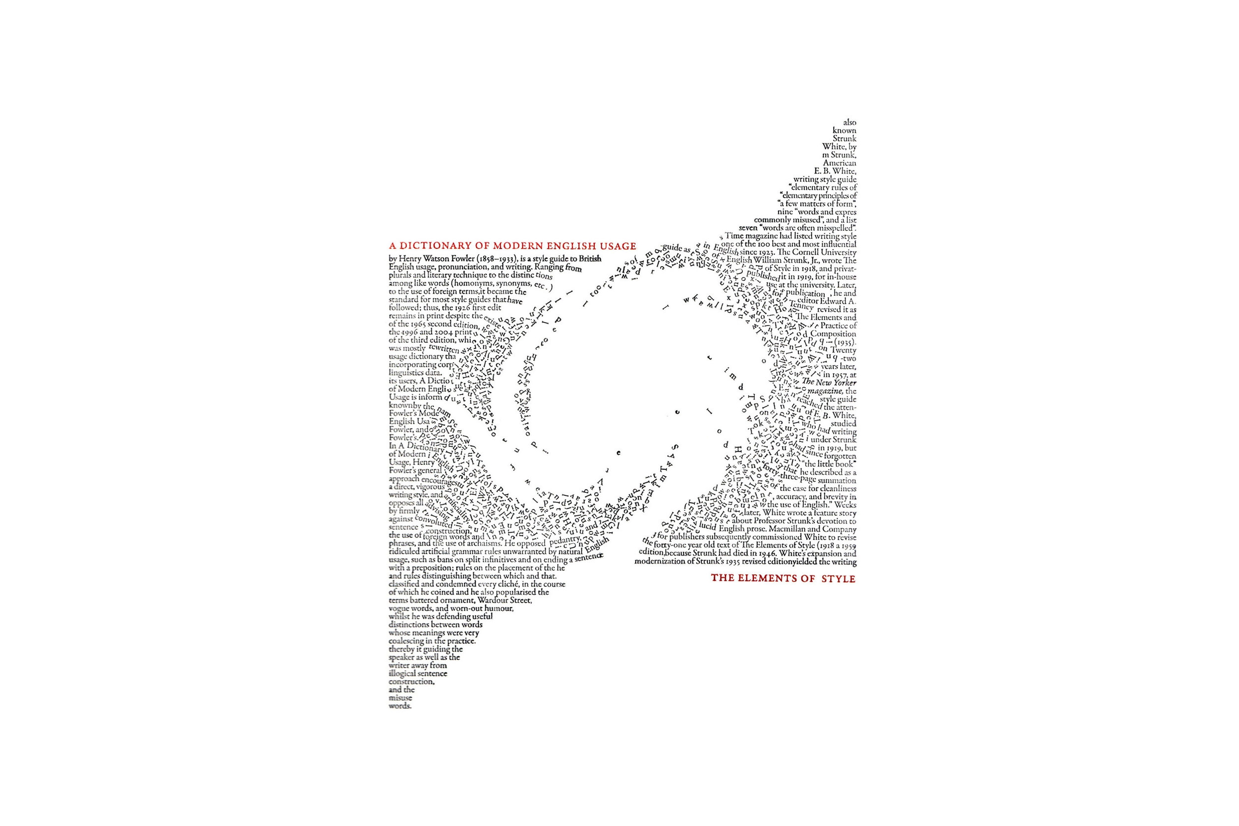
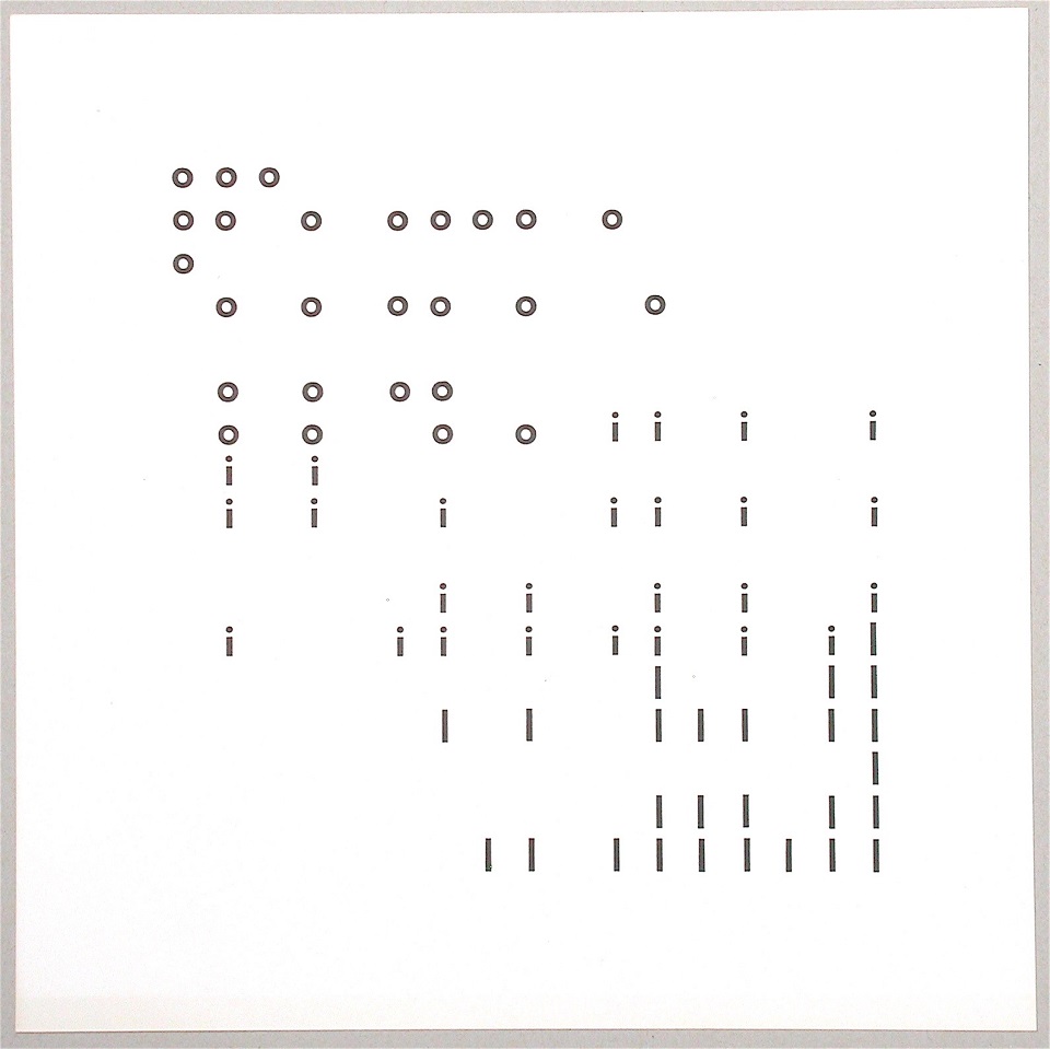
Take the work o i l by Hansjörg Mayer, from 1965. He revealed the graphic elements that fuel, lubricate and underpin our language: the poster is made entirely of circles and lines. The letters fall or slide down the page resembling the fluidity and movement of oil.
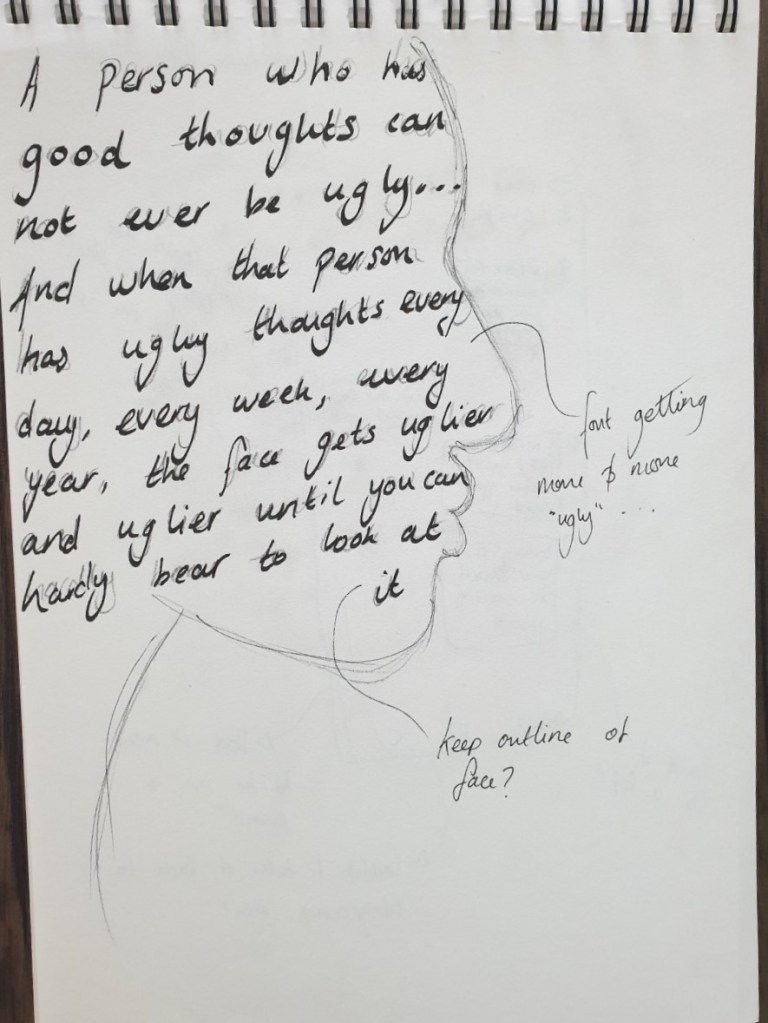
The below are my first quick sketches of some texts that I wanted to focus on. When choosing a text I went back through all the books I’ve read time and time again through out my life. It was such a lovely exercise – I’ll admit as a child I was a complete bookworm. Roald Dahl, Enid Blyton, J K Rowling and more. I’d spend hours and hours reading and re-reading books, getting more meaning, more enjoyment every time. Even now when people ask why I re-read books, I don’t have a set answer, it’s because I get pure enjoyment from them. and even though I know the ending, it makes it that much better because you can start to focus on the actual story telling, the words used, the phrases and writing styles.
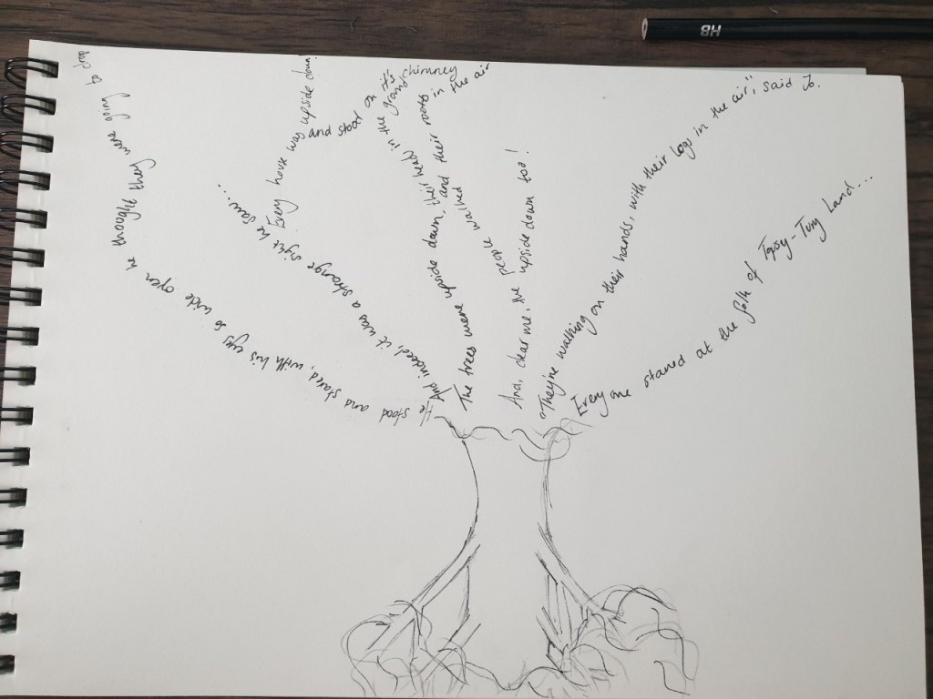
My imagination as a child was amazing and I remember getting lost in books and creating these environments and worlds inside my head. I wanted to use this skill to try to add shape to the texts I chose.
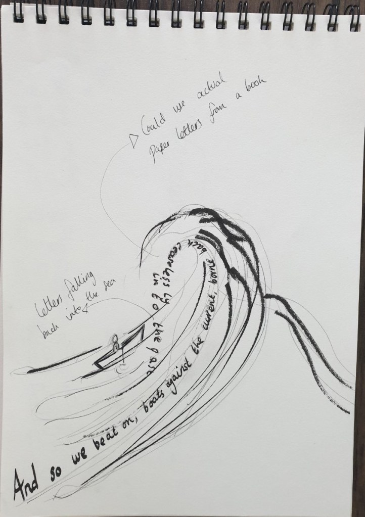
“And so we beat on, boats against the current…” Probably the most famous line from F.Scott Fitzgerald’s Great Gatsby
How can I not acknowledge Roald Dahl’s amazing children’s book The Twits

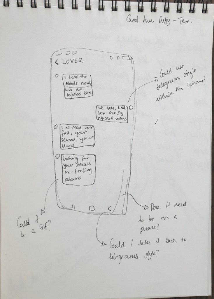
A bit of a different one – Carol Ann Duffy’s poem Text.
I looked back at texts I read when I was aged 6, 10, 18, 28 – and upon reading certain quotes that I remembered I decided to draw the first thing that came to mind. How can we use shaping and form to influence the meaning of the words.
When I studied English Literature at A Level, I remember reading Carol Ann Duffy’s poems and how strong the words were. She was more well known for her love poems as monologues – lonely poetry taking on the voice of someone in a more affected area of society. She was the first female UK Poet Laureate in 400 years and is also well known for her strong feminist poetry. I initially wanted to use the poems from the collection The World’s Wife – a collection of poems told from the female behind famous male figures. I remember this during my A Level studies — they were funny, powerful, emotive and witty. Take, for example, Mrs Midas – the wife of Midas, disgusted at her husband’s greed but longing for his touch…
There was so much choice within Duffy’s work, however poem called “Text” stood out to me. Written in 2005 it’s still so relevant today. A fairly straightforward poem, but it shows the composer of the text messages struggling to convey her message to the other person. It’s written in a format similar to text messages and a lot of the ambiguity we’d find in poetry today is represented in these texts. It’s a fantastic display of how simplistic our writing is nowadays, now we just have a short small space to fill for our text messages there is no room for ambiguity or descriptive language. She uses close rhyming words at the end of every other line, changing how we read the poem outloud – the one word that doesn’t rhyme is “chord”, suggesting a jarring in the writer’s thoughts. As is clear in the last line, Texting is a medium to be read, not heard – I think, therefore, this poem would be great to use and manipulative in a typographical way.
Carol Ann Duffy: Text
I tend the mobile now
like an injured bird
We text, text, text
our significant words.
I re-read your first,
your second, your third,
look for your small xx,
feeling absurd.
The codes we send
arrive with a broken chord.
I try to picture your hands,
their image is blurred.
Nothing my thumbs press
will ever be heard.
My first intention as sketched below was to show this whole poem as a text itself – I could perhaps send the messages through to myself and screen shot it…
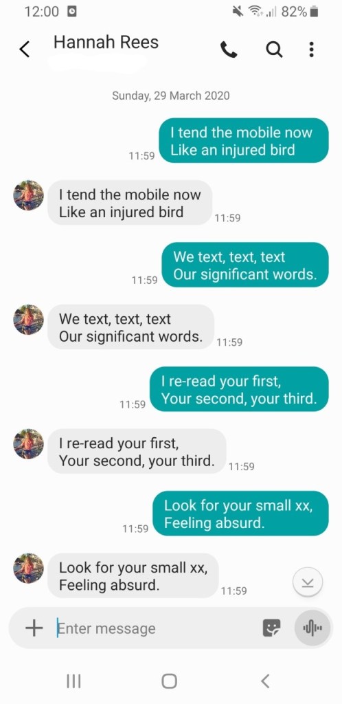
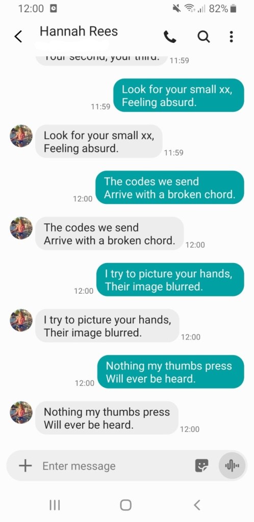
So – I forgot that I was actually sending them to myself so the text messages came out twice – however I really like this effect and it feels like a happy accident! But, does it take away from the message of the poem and also is it too obvious?
Can I manipulate this in any way to make the meaning clearer? Perhaps to highlight the jarring word “chord”?
Also – this poem is also written with a number of full stops, giving it a very ‘telegrammatic’ voice. I decided to research more into the layout and effect Telegrams have…
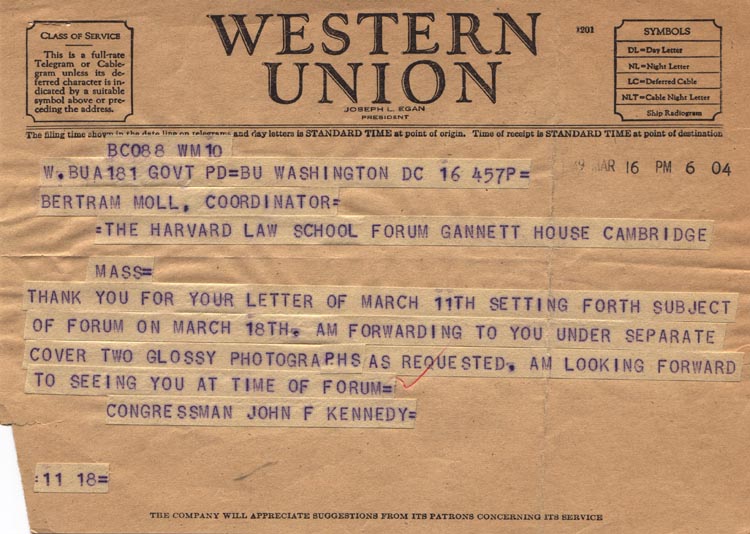
I really like the effect of these telegrams – the uniformity of the lettering and the ‘stop’ written at the end of sentences or the large full stop used really highlights the jarring, sudden end to the sentences.
The font used is the typical typewriter font from the 1940s-50s – reproducing that would be quite simple and I’m sure there are fonts that replicate this. Sadly my printer has no ink so I wouldn’t be able to fully represent the telegram on the left hand side with the cut out wording – I really like this effect so may try to reproduce this somehow!
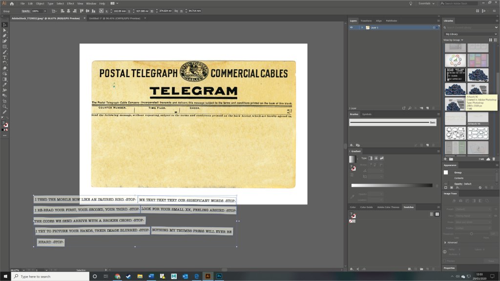
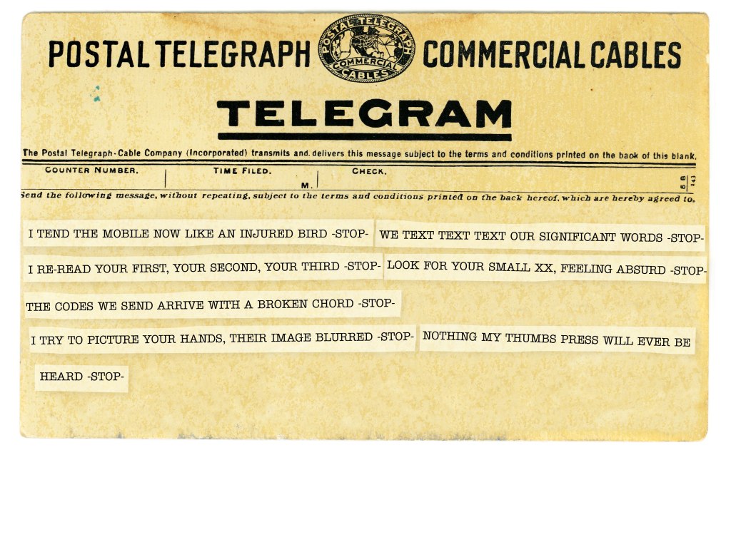
I began the process by downloading a Telegram Style picture to add my wording to. I then cut a small portion of the picture to use as my strip of paper for the lines. I wanted to use the same paper so it had a bit of texture but I needed to edit the levels in photoshop first. I roughened the edges of the strip to look like cut bits of paper and added my text.
The first draft below I wasn’t happy with because the cuts of paper looked too digital and neat. I decided to focus on how I would display the text – the focus needs to be on the end of the sentences – the rhyming words. But the sentence that doesn’t rhyme – that doesn’t fit in – I knew it needed to be on it’s own. I also wanted to add emphasis on the last word in the sentence “heard” – this is what this poem is all about. Text messages, Telegrams, Facebook posts etc are not meant to be heard. Nothing out thumbs will ever press will be heard.
It’s such a powerful sentence and it needed to be broken up for emphasis.
I had chosen a typewriter font to replicate the Telegram style but, again, it appeared too digital and neat. I decided to load it into Photoshop again and play around with multiple layers and careful blurring of the words – this gave the effect of a natural typewriter which wouldn’t be perfect or neat.
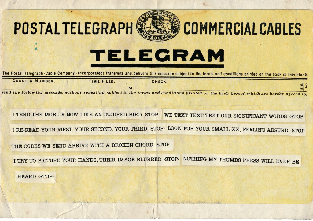
I also decided to add a folded paper texture to the top to add to the meaning – her words aren’t being read or delivered. This suggests the paper has been folded up and not delivered. I like this aspect because it adds yet another layer to the meaning.
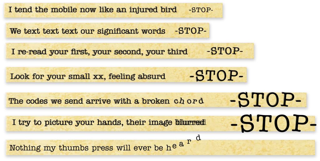
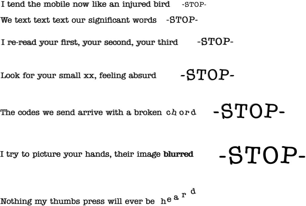
My reason for using the -STOP- at the end of the sentences was to highlight the suddenness to each sentence – she had written this poem in a short dramatic way to make the reader feel as if they were reading a text message. The -STOP- adds an extra dimension of suddenness to the end of each sentence and feels more dramatic.
Having posted this first outcome onto the Ideas Wall very early on in the week I received some great feedback from Tom and Sarah. Mainly that the -STOP- element was really powerful in putting across the message I wanted to convey. Sarah mentioned perhaps removing the Telegram element, making the words sing more – making the actual poem the star of this piece. I experimented with a few different layouts, text changes and alterations. I also played around with the kerning and rotation of letters to make them ‘pop’.
I wanted the Telegram element to remain so kept the text and the small cut out lines. I felt this was a good reflection of what I’d created initially and kept the same message – however I also felt it was quite messy and again, I’m using the background for more of the message.
I then removed the background altogether to have the black lettering playing on a white background. For me, this is far too cold and clinical to convey the meaning of the poem – This combined with the -STOP- element means it’s quite harsh.
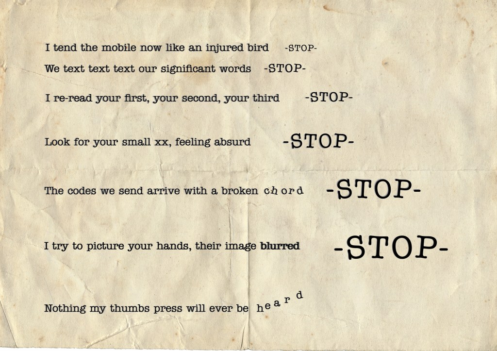
This is the final version I have submitted – I felt it needed a background to link the font to the historical element of the poem (the Telegram style of writing).
In all these versions, I decided to highlight the word -STOP- – this wasn’t in the poem but I felt it makes the suddenness of the ending of the lines really dramatic. So I decided to take this one step further, making the STOP bigger on every line. My intention for this was to give the poem rhythm and speed. The line ending with the word “chord” needed to be disjointed, this word is the one word in the poem that doesn’t rhyme. Same with the word “blurred” – I wanted to play around with the meaning of this word in the way it appears. The word “heard” also was an important aspect to the poem – the whole meaning of this poem is that the words are meant to be read. As with all our text messages now, it’s so easy to send short lines with very little meaning or thought behind them. We are now communicating more by what we write than what we speak – this is a really important message. By speaking to each other face to face we gain so much more information about the words than if they are just written down to be read. I wanted this word to reflect the fleeting nature of the way our species no longer communicates face to face.
https://aestheticamagazine.com/design-concrete-poem-lighthouse-scotlands-centre-design-glasgow/
