This week has been a fascinating insight into how typography has been used throughout history. I have to say, when looking at the work for this week I was at a complete loss. I’ve never really researched much into Typography before and find I don’t question why I use a certain font – it’s just a thing we do naturally without considering it’s effect.
Interestingly this week my sister, who works for Investec as a risk consultant sent through a screenshot of the work she’s been completing whilst in isolation – the first thing I had to ask was why she chose that font. It turns out the company have a font created for use for publications or reports so it is all uniform throughout the company. It was only a small detail but I didn’t instantly recognise it as one that is used a lot. I find it fascinating that companies require the use of one particular font for headings and main body text, especially in a financial company as majority of people writing their reports won’t care what font they use. And most would probably end up just sticking with Times New Roman (is that mean?)
I’ve also been hugely inspried this week by looking into York’s history of typography and production – I’ll come to that later looking at Letter Press history within York.
Firstly though, the basics : The Anatomy of Type.
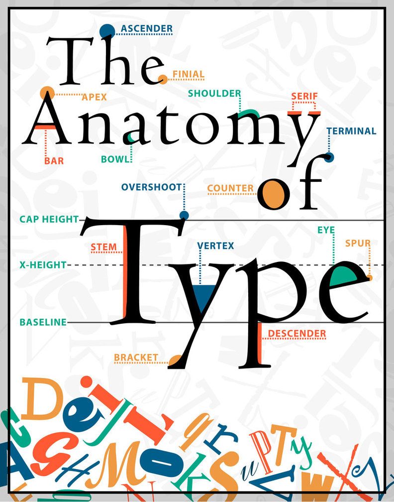
This break down, along with listening to the lecture this week helped me breakdown and understand the meaning of the words that are flung around so often by designers. It’s a resource I know I’ll come back to time and time again as this process continues.
Historically, texts were produced by hand – laborious, time consuming tasks that if done incorrectly could be costly. Medieval scribes followed a symmetrical page structure and their work required so much precision and time. A lot rode on the scribe’s ability to put down the authors words onto paper – if it was illegible, the authors work was useless. During this time, the common script was Caroline Miniscule contributed to the collection of Humanist scripts which are all very similar to Times New Roman.
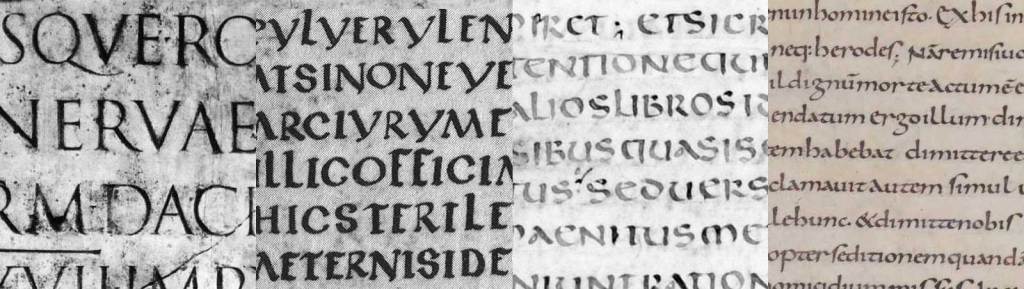
Along came Gutenberg in 1455 who realised this laborious task of scribing every letter and word could be recreated in a form of moveable letter press. He fashioned the letters for the press from the local script used in Germany at the time. The current script in Germany was created using wide nibbed pens and thin/narrow lettering. This Gothic style is still recognised today and is under the umbrella font family of Blackletter Type.
This form of mechanical moveable letter press then was adapted by the Italians who became the valuable centre of moveable type. The Italians had their own specific script which had much more negative space and free flowing scripts and serifs. This airy feel is still commonly used as the majority of script fonts and is categorised as Whiteletter Type. (Deer, 2016)
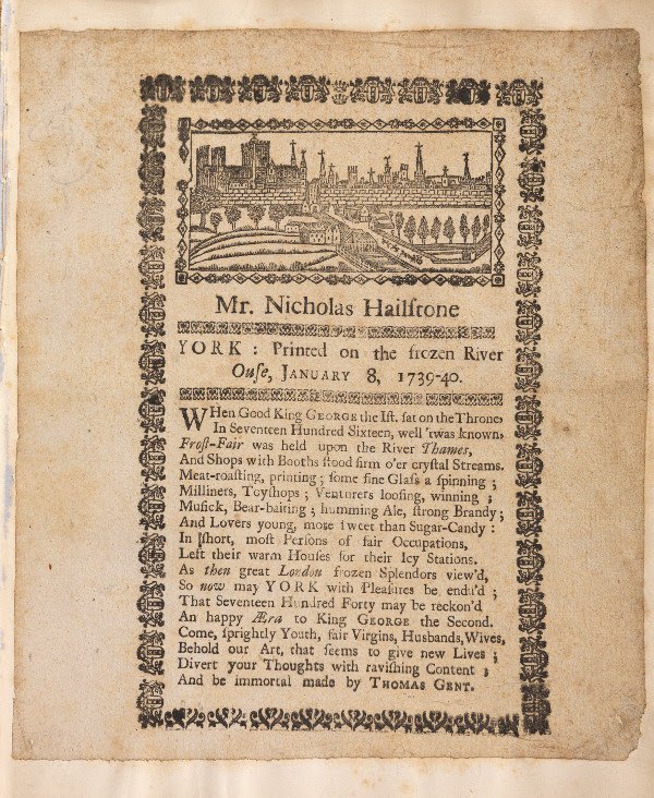
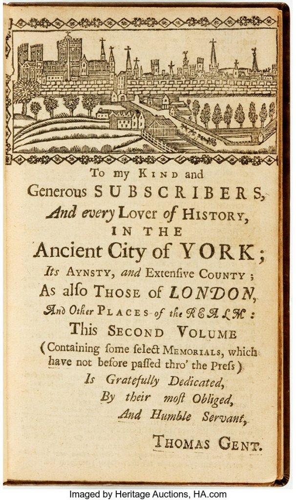
I then went on to research into the history of letterpressing within York – this small city became the epicentre of letter press for religious texts during 1600s. An act in Parliament limited Bible printing to just 2 Universities – one of which was York. The printing businesses became very family run and passed down generations leading to the most renowned printer in York – Thomas Gent. He eventually became the publisher of Yorkshire’s only newspaper The York Courant.
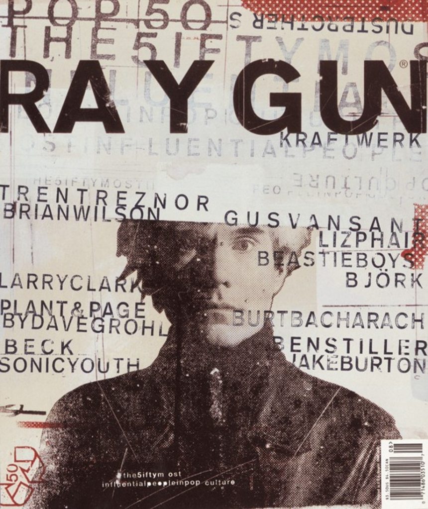
Moving forwards a few centuries and we begin to look at the “punk era” of typography. The Ray Gunn Magazines and The Face covers all represent a new era in non-structured typography. An era I can get on board with!
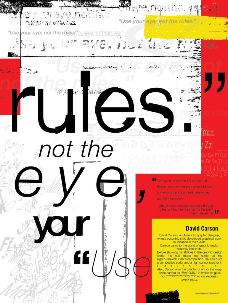
Personally I feel typography can be so set in grid patterns, hierarchy and more rules that in fact limit the designer’s ability to produce work that represents their personalities. Enter David Carson and Neville Brody.
Carson’s work on Ray Gunn broke all the rules available – he was not trained in Typography or design but infact followed his gut instincts and created work that, on most occasions, was almost illegible. I found it fascinating in a few of his interviews how he discusses the studies that have shown people who read a text in the alternative fonts that you struggled to read, retained a lot more information than the others who had the same text in Helvetica. He draws people in and wants people to get closer to the page to work out what is being said. I have huge respect for this kind of work, it’s so easy to fall into the same traps of grids and rules that you lose the main intention of the piece. He touches on the fact design nowadays is homogenised, always the same layouts or all caps fonts, similar to our research into the effects of digitalisation and globalisation of design, having the same rules for every piece of typograpical work means it’s all starting to look the same. And that’s boring.
Neville Brody also reflected this topic nicely lookingat how Type is in fact image – it can be manipulated in the same way and used the same way. If we all look at image and type as two different subjects we lose that flexibility. He refuses to follow the rules and this process results in the fantastic magazine covers for The Face
I have come across many modern designers who take delight in breaking the rules of typography and use this to their advantage – quite often, confusing the viewer and encouraging them to use this typography to create their own meanings.
For me this week, it’s been a combination of understanding the strict rules of typography and respecting these rules. But also acknowledging that it’s absolutely, 100% OK to break these rules. We don’t need to stick to the same old grids as everyone else and we don’t need to use one certain type of font because it’s “easier to read” than others. We can break through these barriers and hopefully begin to stem the flow of seriously boring homogenised typography design that we see all over Pinterest, Behance etc.
