Firstly, I found this task so informative and inspiring! All Designers chosen to interview were so different and abstract it really helped learn more about the ways in which choosing which agency to work with is a very personal choice.
Intro Design Their identity was very traditional Graphic Design. I really appreciate this and understand how they see Graphic Design as problem solving. Their development from project to project was evident and how they see it as a new “whole world to inhabit” for each project is fascinating – A.K.A learning about each different client whether it be a band or author, they adapt for each one and use their other artistic skills when needed to reflect their client’s identity. their passion for design and art really shone and they taught me that the focus is really on telling a story effectively rather than being overly concerned on how it looks. I loved learning about their use of collaborative work – only using others when needed and having their own individual clients. This seems to be a different style of working within design and comes across more traditional.
Sam Winston What an interesting designer to focus on. He’s so different to the others that were interviewed I had to research further and found his Instagram page. I subsequently spent the whole evening looking at all his projects and the subjects that interest him. He has recently finished a project called 7 Days – he spent 7 whole days in complete darkness transcribing 5 sentences again and again. The change in hormones and sleep regulation meant he suddenly began to focus on a whole alternative sense of self. He describes how suddenly simpler parts of your body begin to really define your sense of self. From the outset, Sam explained how his Dyslexia began to define him and he became fascinated with using type to problem solve – itinially book based he has used letters and punctuation to create his own artwork. He uses his own space to work, he doesn’t share space with others and needs it light and quiet. We can all relate to needing quietness sometimes to reflect and work. However, despite his non-collaborative nature he enjoys being around other creative individuals within London. His work ethic is incredible and, for me, his work defines typography – how it is used and manipulated to put across a message in a clear, funny and interesting way – it left me wanting to find out so much more.
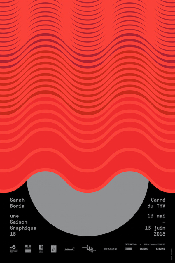
Sarah Boris This skilled designer seems to focus on very clean lines and colours. Her description of how she developed the posters for her design exhibition was amazing! Not just to show off her work but to reflect the stage she had in a beautiful theatre was inspiring – She uses cultural and local inspiration to feed into her practice. Her simple lines tell a clear story in a very abstract manner. Looking at her work I appreciated her use of empty space and not feeling the need to use all of the page. This empty space is vital in ensuring her work is clear and easy to understand. I also really enjoyed the book Le Theatre Graphique after she drew inspiration upon the work for her exhibition.
Regular Practice These designers were almost polar opposites to Intro Design! I loved their outlook on design and typography. Being type-centric I feel like I can learn a lot from these guys and their workflow. They start with type and go from there – their curiosity is vital to their work as well which really inspired me. I love this mentality of delving as deep as possible into each new project and the background of each project. It’s almost as if they become a part of that world for this one project, their need to explore, adapt and try new things is just exactly what I think being a designer is all about. As they put it themselves, this isn’t necessarily “nerdy” but an ability to dive into something new. It was also interesting to learn how they had to really develop their business strategies as they had to learn on the job which contracts to use and payment methods etc. It’s all part of a new venture and something we will all have to learn in order for a business to flow effectively – I do massively appreciate, however, that they tried to learn all this by themselves rather than just hire someone who can do it for them. It may have been just funding that stopped this but I also see it as part of their “not-so-nerdy” nature!!

Someone Wow – what a different company to the others! Firstly their focus is on branding and telling a story through their designs. They focused on so much (I suppose being a bigger company means they can) – films/sculpture/typography/animation etc. The Olympics gig must have been huge, and as they explained in the video, having to tell not only one story but a story for all the different sports was a big task. Being worldwide, this just shows how their use of storytelling is vital to a successful design business. They believe there is a difference between Digital Design and Graphic design which was interesting – I’ve never considered this before. He also really expressed how design is a successful combination of both dreamers and designers – just as Architects need Engineers.
