Last week finished and I think we all felt a bit exhausted at the amount of self reflection we had done over the past few weeks. I think to look at yourself as a person, an individual, where you fit in society can be quite draining and not something any of us thought we’d have to do on this course to this extent. And I thought this week would be similar, in the sense that we look at ourselves but also have the chance to critically analyse other work too.
However, this week was purely about ourselves – who we are, what we do – getting deeper and deeper into the real “us”. Winnie put it perfectly on the Ideas Wall, that we as Designers learn to understand our client, not necessarily us. But personal branding is a very necessary thing to ensure we stand out from the crowd. The quick lecture on the expanse on “self” in Psychology just exhausted my mind and a few days away from the computer with family has meant I feel more centred and ready to tackle this huge subject.
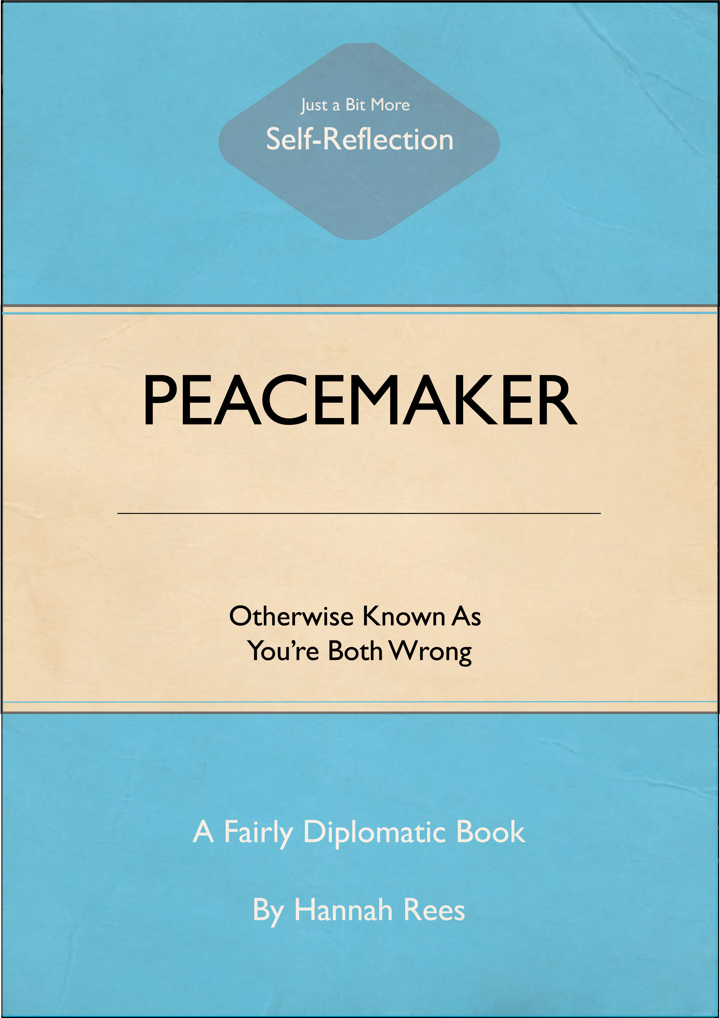
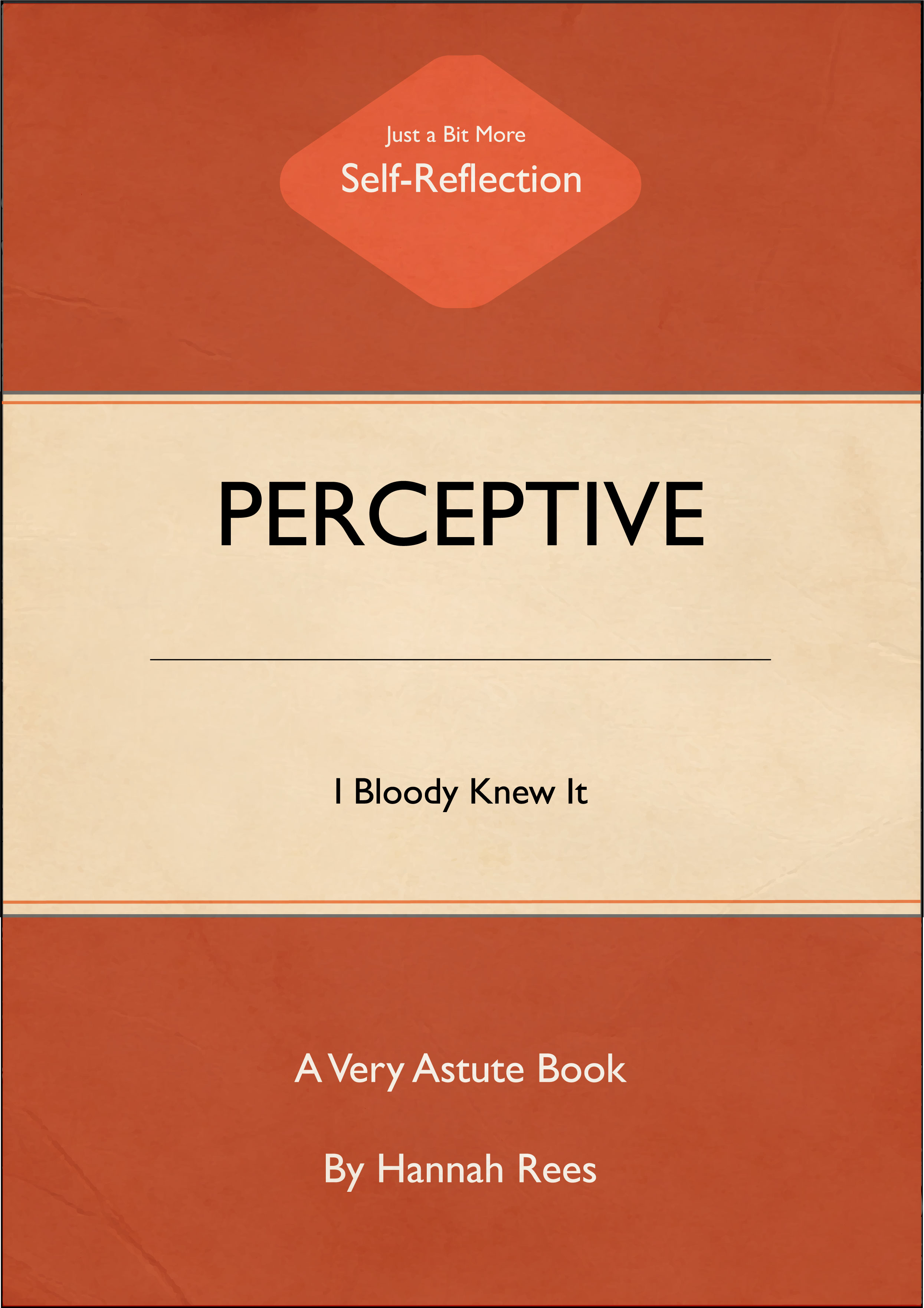
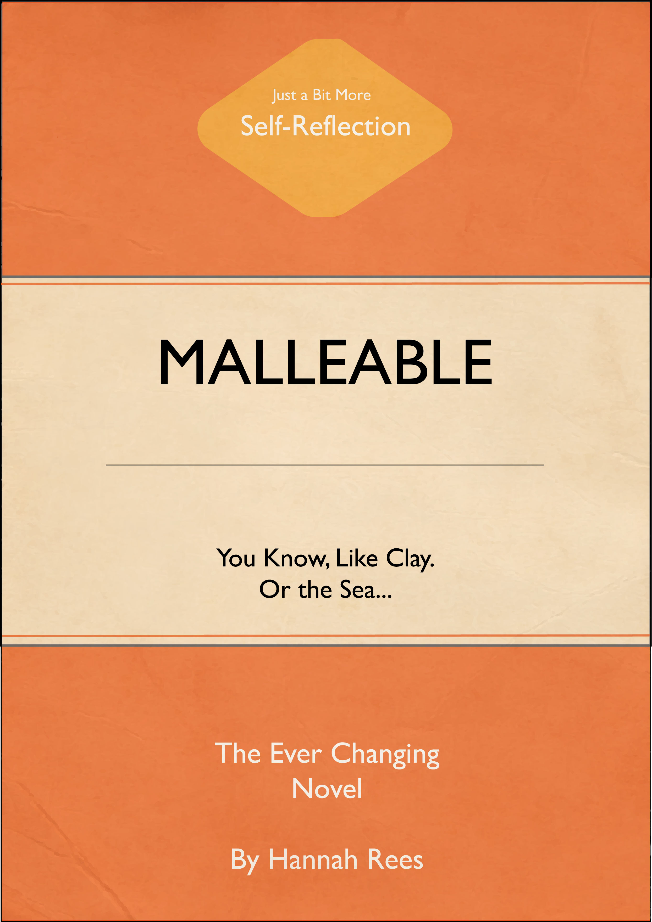
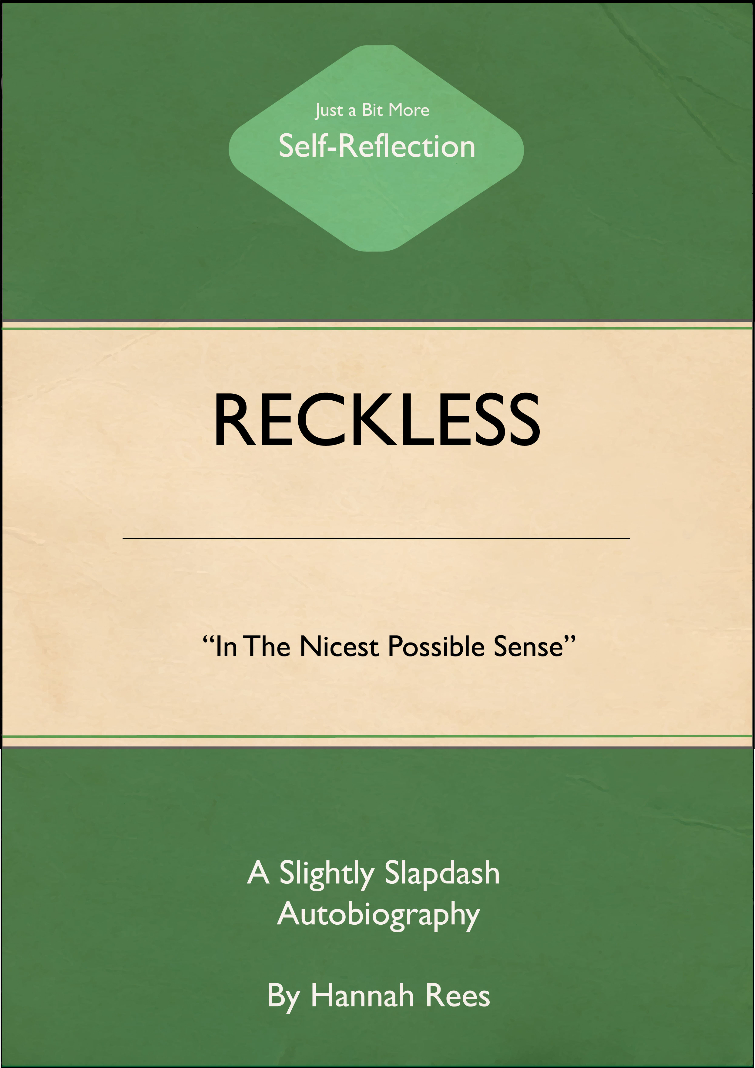
I visited York Art Gallery this week as they were exhibiting the work by Harland Miller (An amazing Yorkshire Artist / Designer). I really enjoyed seeing his work in the flesh and had such a laugh at his witty comments – this made me realise I need to bring out my humour in more of my work. It’s what makes me “me”. Que a quick rewatch of some amazing Monty Python sketches and I decided to use the inspiration from Miller’s work to create my own Penguin-Style book covers.
My twenty words this week were as follows:
- Calm
- Passionate
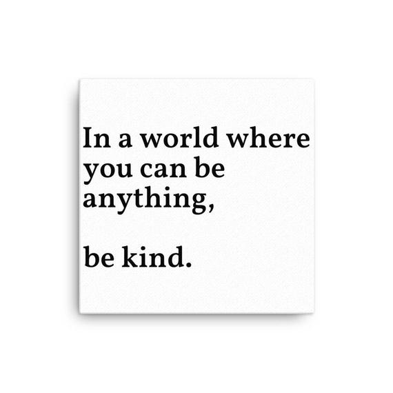
- Kind
- Honest
- Spontaneous
- Creative
- Curious
- Reckless
- Experimental
- Brave
- Colourful
- Malleable
- Perceptive
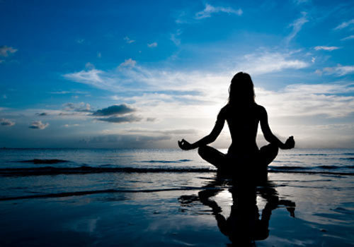
- Mindful
- Outgoing
- Hypocritical
- Changeable
- Sponge
- Optimistic
- Adventurous
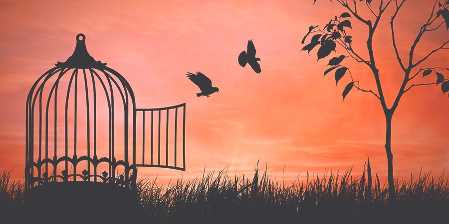
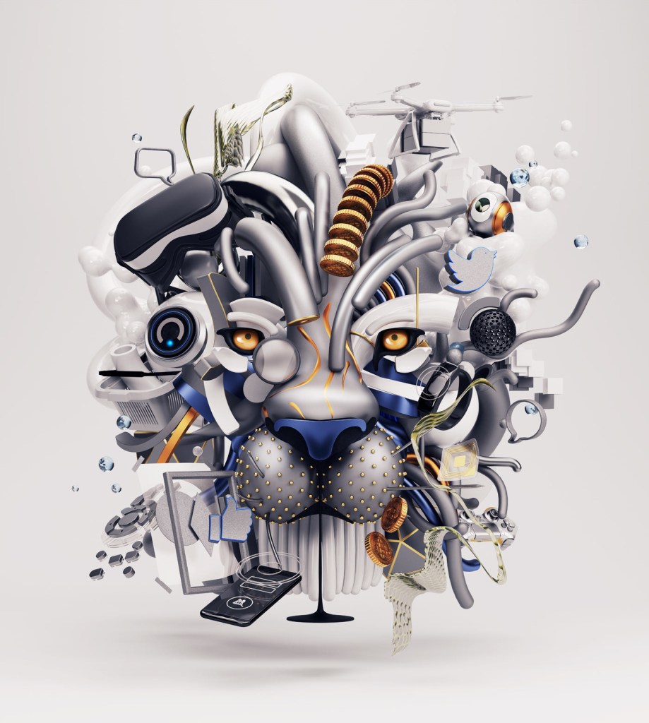
I narrowed these words down to 5 main categories which are displayed below with visual elements I feel sum up these categories.
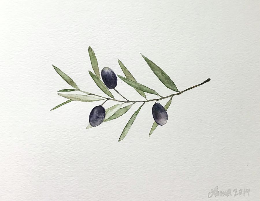
PEACEMAKER
The peacemaker – as the youngest child in my family, I have always been known as the peacemaker!
As a child I loved butterflies and the peaceful way they fly around the gardens.
MALLEABLE
To represent my “malleable” side, I chose waves, the sea – changeable like the tide.
I see malleable as both a negative and positive trait – to be a good designer you need to mould your work to fit someone else’s requirements.
PERCEPTIVE
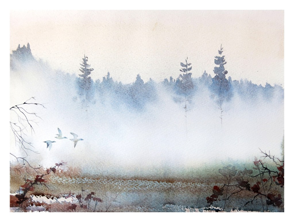
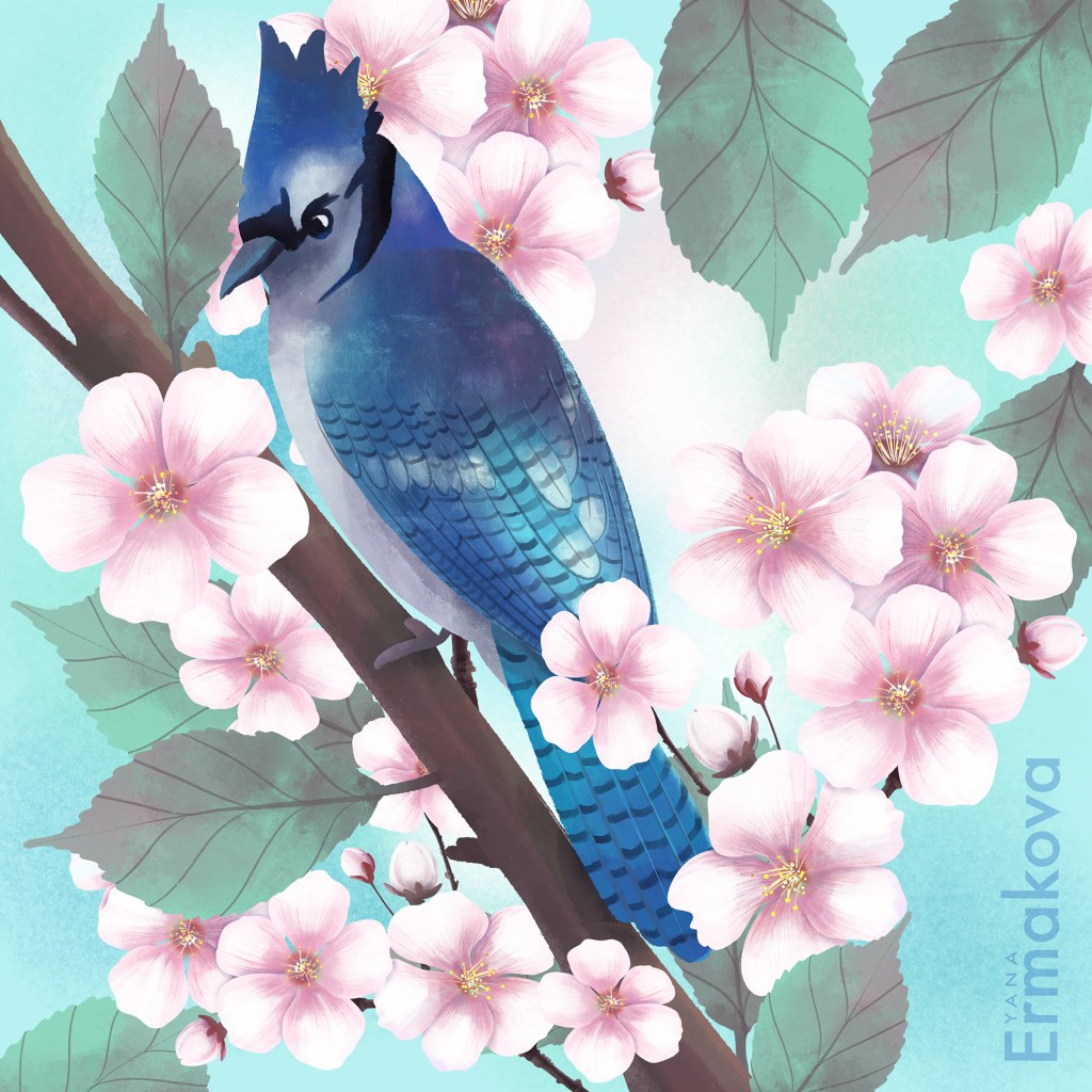
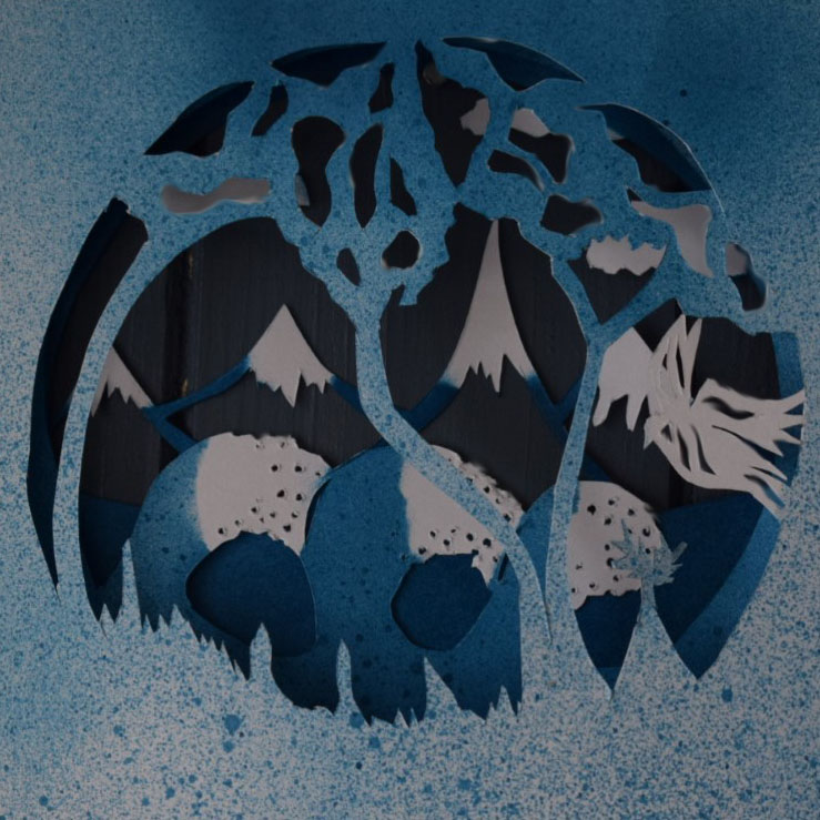
To show my perceptive nature, I chose trees and a bird – I can always see the light through the trees, I know that no matter my state of mind, I can always see the positive.
The bird, to me represented the optimistic side to this trait.
ADVENTUROUS
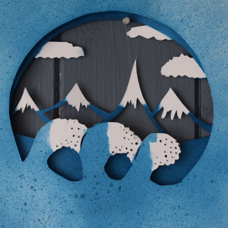
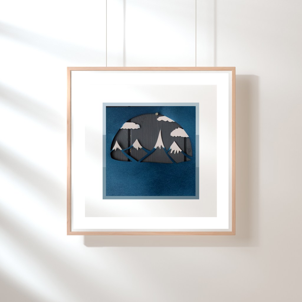
To represent my adventurous side, I chose to make the background cut out a set of mountains.
For me, mountains have always represented adventure and bravery – a trait in myself that I am very proud of.
BRAVERY
Perhaps a direct contrast to peaceful, I am also reckless and brave. I tend to do things without thinking – I change my path or course in life without using my head.
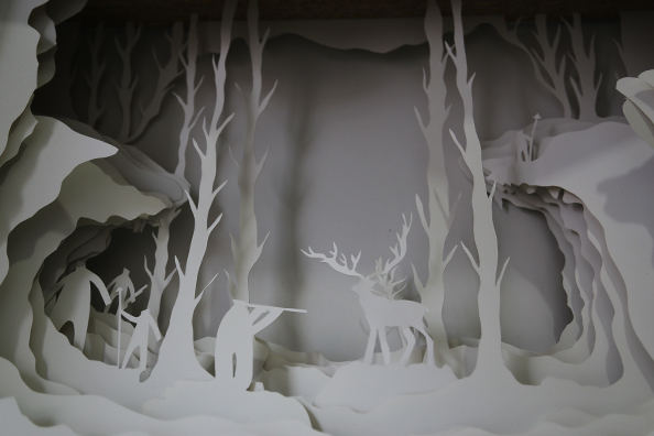
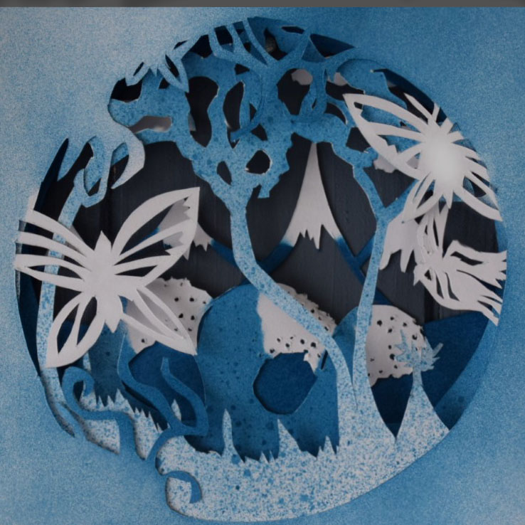
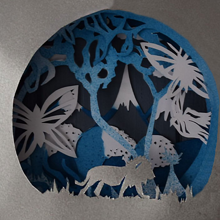
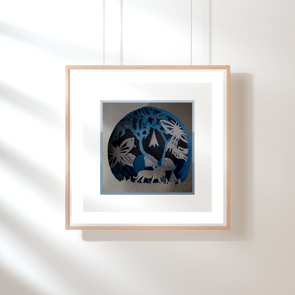
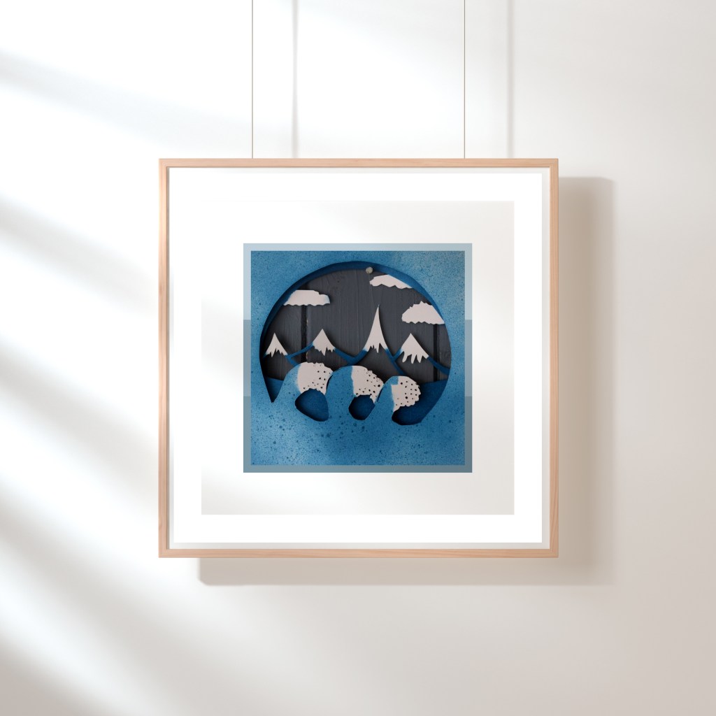
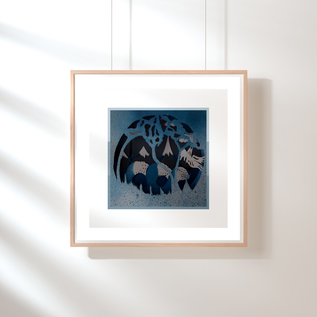
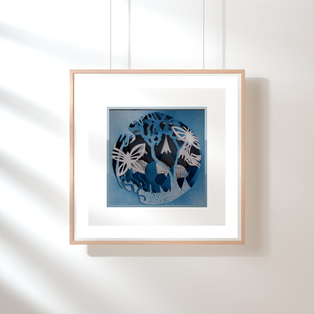
I initially created a paper cutting layered piece of art work to show how I see symbolism in all of these words – I wanted to portray that although we are creating one piece of work, it is multi-layered and some aspects are more prevalent than others. The gallery below shows my work – I intended to create a video layering them up one after the other. I spent a long time mulling over whether this displayed “me” – After a lot of touching up and spray painting I decided this doesn’t portray my personal sense of “self” as much as it could have done. I suppose this also reflects my ‘changeable’ nature but I wanted to submit something I was proud of, was polished and reflected me clearly.
However, having seen how Harland Miller uses his work to strongly connect the viewer with his personality and sense of self, I just felt like I had to get inspiration from his work. I’ve used the basic layout of the Penguin books and instilled my own sense of humour into the layouts to reflect what I think of each of the aspects.

Changes made after feedback:
Ok – this week was a huge challenge for me. I constantly changed my mind and my expectations, confused about how to represent “myself” I ended up representing myself in the worst way possible – by emulating someone else’s work.
I joined this course so that I could find identity in the work I create but this is so much harder than I realised. I feel like I let myself down this week and looking back, I should have had enough conviction to follow my initial idea through.
So that’s what I’ve done during my Easter break – I’ve tidied up the papercutting work and made it clearer. I took better photographs and I’ve also prepped it to frame in my room. Due to the Coronavirus stopping us going out I haven’t been able to purchase a frame but I have created a collection of pictures showing how it would be displayed.
For me, the build up of the different layers really reflects who I am – we are not just made up of one layer but muliple and these are always going to be changing. Who I am today is not who I was yesterday nor tomorrow. Looking back now, 6 weeks after starting Week 4, I can already see my changes and my own personal development. And this is a huge achievement for me!!
I’ve decided to have this hanging in my room to remind me that I am always developing and getting better – but also I am brave, reckless, malleable, adventurous etc – I am all of those things and I should be proud of that. My weaknesses aren’t something to be angry about but something to acknowledge, accept and develop upon.
