


I wanted to create an editorial review which reflected the ways in which I now access new designs. I am trying to break through this by networking around York with other designers and agencies but I have been most connected so far through Instagram. I felt I had to demonstrate this in some way and was really inspired by Winnie’s work for the first week. Her use of the iPhones and iPads really highlighted to me how you don’t need to follow the norm when displaying something. So hopefully this has had the right impact. I had to cut down some of my synopsis to stop it being an information overload but I feel it clearly reflects my thoughts on each project and below is my full synopsis with more discussion on the range of categories within the D&AD Awards (which were, by the way, so inspiring I’ve spent hours this weekend looking into many different agencies and designers who created these works).
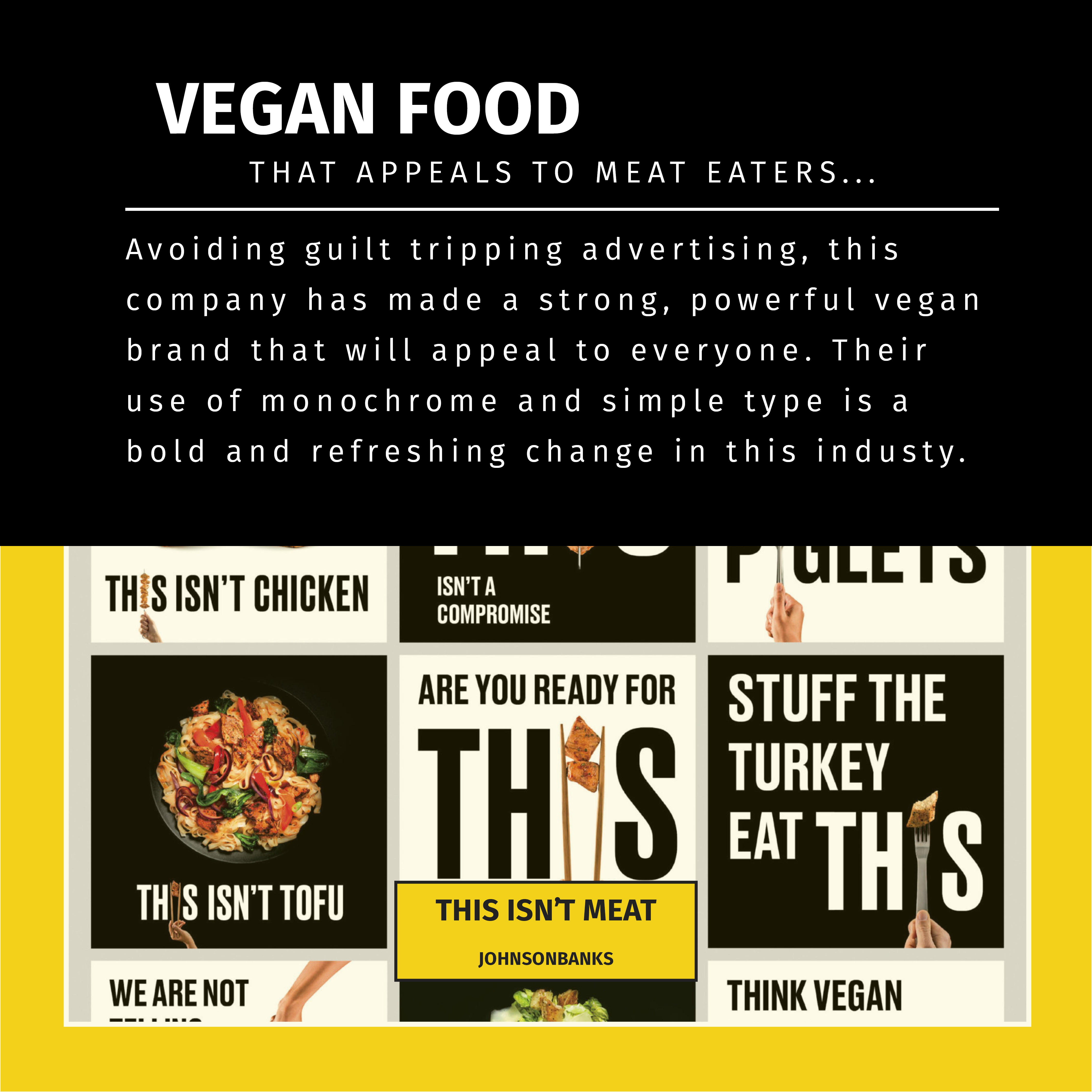
Synopsis: I believe Design exists to tell a story in the most effective way possible. To me, Design shouldn’t be categorised and all aspects of Design should overlap with others. Take Sam Winston for example, he sees his work as purely typographical based but he also uses this talent for book design and publishing. If his work was entered into the awards would he want to be within the Typography category or would a certain publication he’s helped produce put him in a different category? I chose The Creative Circle’s publication to show how the category of Book Design also takes into account the strong use of typography. This overlap results in a fantastic, humorous book which reflects their wish for a book to “break every typographic convention” – so should this book have been in the Typography category? Their need to stand out and prevent their work from fitting in with the other books on the bookcase resulted in this fascinating design. For me, it relates back to our discussions on how use of digital media available at our fingertips results in homogenised design. Similarly, Split Design worked with many different trades to introduce more skills into their work – the use of engineers, printers, writers and even the general public meant this experiment grew in multiple directions to produce a wonderful representation of The North. By involving all these different people from different walks of life, they were able to look into how different stereotypes are represented and challenged this. Communities can be so different on a cultural, political and economical level and I felt this was reflected in the work produced. For me, this category was firmly Typography.
This week has been based around our discussions regarding Design Categories and if we feel designers should fit into just one category. Can you be an artist and designer? Does limiting your boundaries prevent your work from being the best it can be? Do we need terminology when looking at design? For me, if I’d been tasked with putting the given design pieces into the categories for the awards I wouldn’t even have 50% right. There was so much overlap it’s hard to know where one discipline starts and another begins. For example, the “side hustle” category covered all different disciplines and the winner was a VR film series. The fact that branding and branded content were separate categories also baffled me initially – but upon further research I realised Branding went beyond logos. Looking back at the first list I’d made of what I thought the many types of Graphic Design were, I was very traditional in my thinking. I hadn’t event considered design for exhibitions or films. When we think of just Graphic Design categories do we inherently limit ourselves to the types of Design we’re interested and do we need to start thinking on a much wider, global scale? Does the introduction of globalisation within Design mean these categories will change year upon year?
Changes made following feedback:
I really enjoyed this week and seeing how everyone’s editorial pieces were so different. I realised I needed to show mine as if they were displayed on an Instagram feed or post.
Therefore I mocked up a version of my Insta-editorial to reflect this feedback. I also create a GIF so the editorial can be viewed without clicking for the next page – however this means the wording can’t be read properly so isn’t the most useable outcome (I still really enjoyed creating the GIF and I know I’ll use this skill for other weeks!).


